My app uses some webviews. They look great on standard mobile devices - but of course on wider screens - like ipads or tablet phones - it doesn’t scale responsively because the width is static. Is there a workaround for this?
Hey there @deevalicious
Adalo is not “responsive” so you have to create screens for different device sizes.
I use the “Device Detector” component by NoCode Monkey:
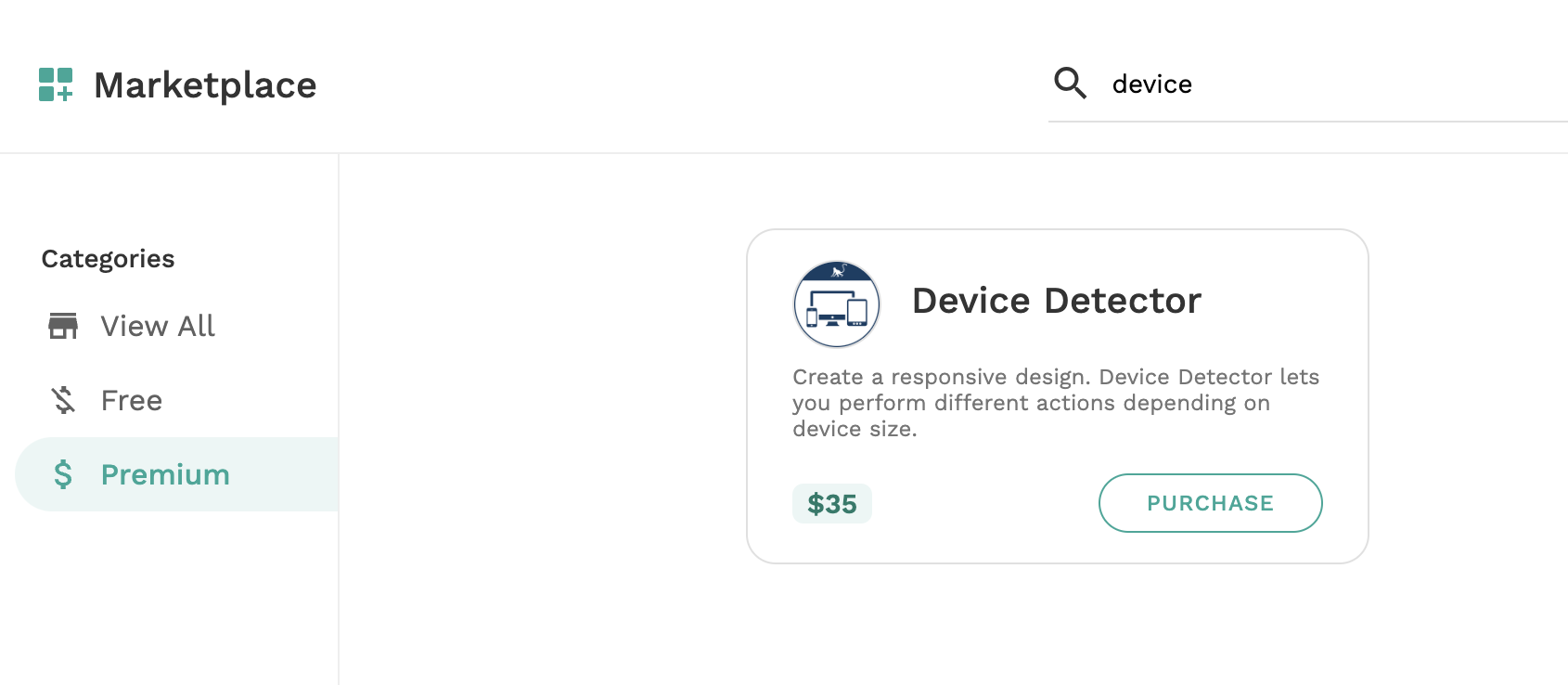
You drop this onto the screen and direct users to different screens based on the user’s device/browser viewport dimensions.
A couple of examples:


Thank you 