aryan
1
Hi, when I click on preview my app is displayed perfectly but when I test it on actual devices (different ones) the look and layout changes.
For eg. If i’ve joined 3 components to make a square, it looks like a rectangle or worse on the actual device. Even lists don’t stay properly
What can I do to fix this?
Hi @aryan
This is a very common topic with many posts around it.
I suggest doing a search for the other topics and reading the recommendations provided there, which are usually the same ones each time.
aryan
3
Thanks Charles! I’m not sure what the issue is identified as so what should I search up?
Hey there @aryan
Can you provide screenshots of what you see in the editor, what you see in the previewer, and what you see in the native builds?
Then, screenshot how you have the lists and groups within the screens.
In most cases on this subject, the solution is usually just to add some rectangles as spacers/backgrounds of sections to keep things aligned well.
Similar to these, perhaps?
aryan
5
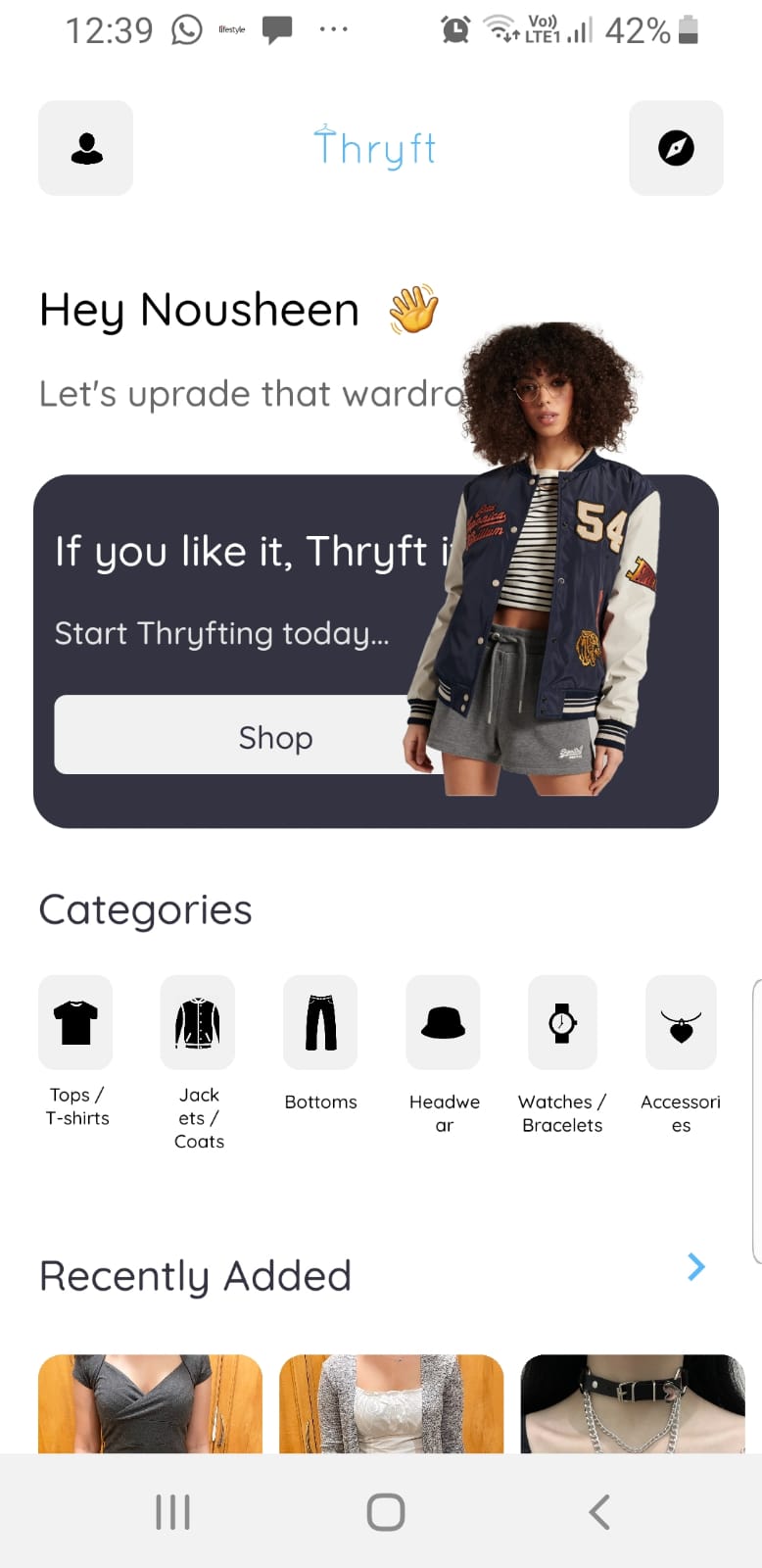
Attached screenshots below show what it should look like (adalo preview) v/s what it actually looks like:
Issue: Image of the girl in the box and text of the categories
–
Issue: KYC, ORDERS, SALES BOX & BUTTONS TEXT / SIZE
And a few more similar issue like these occur. This is mostly happening only on android
In regards to the first screenshot, ensure that you do not have your text overlapping the image.
Keep in mind that different devices of different sizes may cause components to be closer together.
I’d recommend slightly smaller font sizes and less padding to try to allocate for the different screen sizes.
aryan
7
Thanks so much for the response! I’ll try these things out