The Advanced Input custom adalo component by Templar Design provides a variety of settings to help you style and customize the input field. Add an icon to the input, set the input as a password reveal input, and add a “submit action” (when a user presses enter on their keyboard, actions can fire).

Check out all of the settings and a few use cases here:
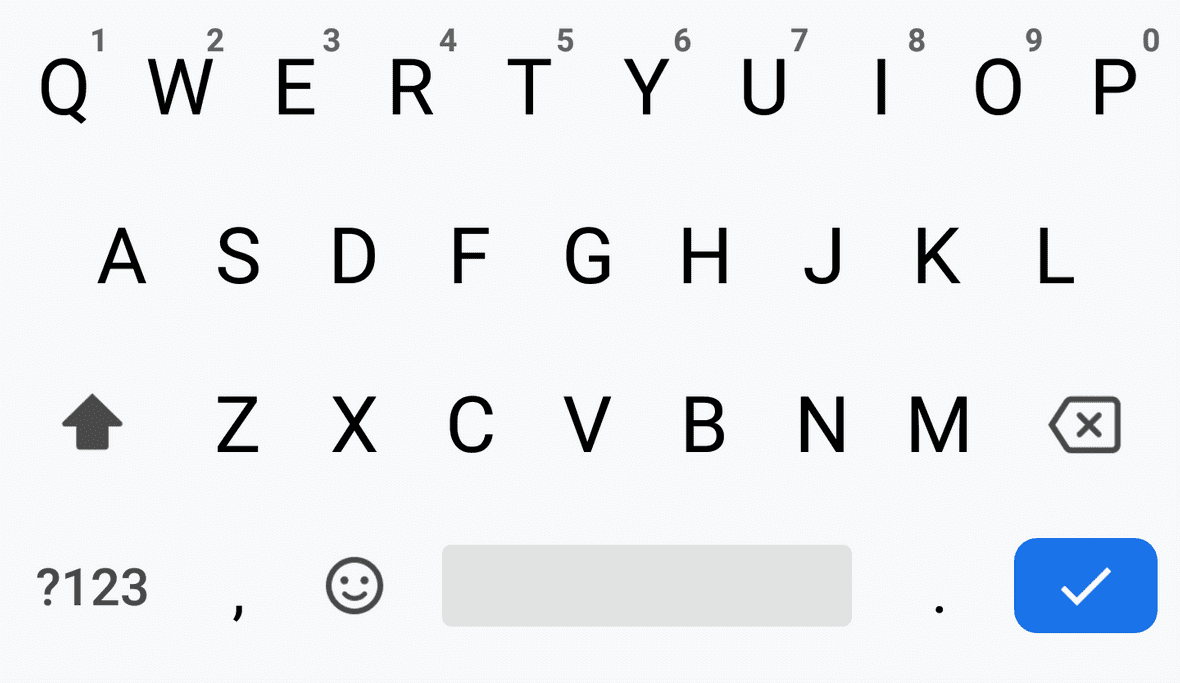
Advanced Input Custom Adalo Component Keyboard Types:
Once you have the Advanced Input custom Adalo component on your canvas, you can start customizing it by changing the “Keyboard Type”.
The Set Keyboard Type setting allows you to select the keyboard type that will be used when the input component is active. The options are Default Input, Number Pad Input, Email Input, and Phone Pad Input.
Default: Default displays the qwerty keyboard and allows users to enter numbers, letters, and special characters.

Number Pad: Number Pad displays the number pad keyboard and allows users to enter only numbers.
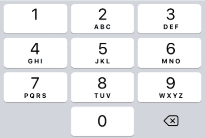

Decimal Pad: Decimal Pad displays the number pad keyboard with a decimal point and allows users to enter only numbers.

Email: Email displays the email keyboard and allows users to enter only email addresses.


Phone Pad: Phone Pad displays the phone pad keyboard and allows users to enter only numbers.


Default Value: The Default Value setting allows you to set the value of the input component when it is first loaded. This is the value that will be displayed in the input field before a user begins typing.
Additional Advanced Input Custom Adalo Component Settings
Password Reveal: The password field toggle enables the input component to be used as a password field. When this toggle is turned on, the characters typed by the user will be hidden and a visibility icon will be displayed. Tapping the visibility icon will reveal the password.
Placeholder Text: The Placeholder Text setting allows you to set the text that will be displayed in the input field before a user begins typing. This setting is helpful for prompting users about what kind of information they should enter into the input field.
Max Characters: The Max Characters setting allows you to set the maximum number of characters that can be entered into the input field. This setting is helpful for ensuring that users do not enter more characters than you have room for in your database
Allow Multiple Lines: The Allow Multiple Lines setting allows you to set whether or not the input field will allow multiple lines of text. This setting is helpful for ensuring that users can only enter one line of text if you only have room for one line in your database.
Autofocus: The Auto Focus setting allows you to set whether or not the input field will automatically receive focus when the screen is loaded. This setting is helpful for ensuring that users do not have to click on the input field to begin typing.
Submit Action: The Submit Action setting allows you to set an action that will be triggered when the user presses the enter key on the keyboard. This setting is helpful for ensuring that your users can submit their information without having to click a submit button. This setting does not work when “Allow Multiple Lines” is enabled.
Text Styling: Text font, font weight, font size, and font color can be customized in the Default Value text styles section.
Background Color: The background color of the input can be changed.
Border Radius: The border radius is the rounding of the corners of the input.
Border Color: Border color (warning) will display this border color when the input is left empty after clicking on it or if the user has not completed the validation (like an email address).
Icon Toggle & Styling: You can enable or disable the display of the icon with the “Display Icon” toggle. Then, you can set the enabled/disabled icons and the colors. You can also set the size of the icon.